Google Refreshes Iconic 'G' Logo with Brighter Hues to Reflect AI Era

Google Updates Iconic 'G' Logo for AI Era
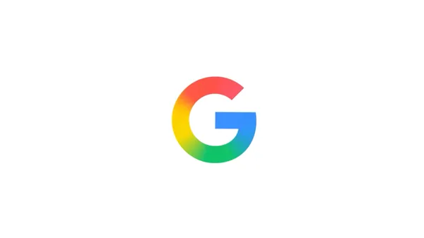
Google has refreshed its iconic 'G' logo with a brighter, four-color gradient design to reflect the company’s evolution in the AI era. The updated logo symbolizes the surge of AI-driven innovation and creative energy across Google’s products and technology.
This redesign retains Google’s signature four colors but introduces brighter hues and a gradient effect to emphasize the dynamic nature of AI advancements. The new 'Google G' will represent both the brand and the company as a whole, unifying its visual identity.
The Meaning Behind the Redesign
The updated logo was first introduced with the Gemini spark in June 2024 and will gradually roll out across Google’s products, platforms, and services in the coming months. The brighter colors and gradient are intended to convey the vibrant and transformative impact of AI on Google’s offerings.
This visual update aligns with Google’s broader strategy to integrate AI into its core products, signaling a new chapter in the company’s history.
Impact on Branding and Technology
The logo redesign is more than just a cosmetic change; it reflects Google’s commitment to innovation and its leadership in the AI space. The gradient design represents the seamless integration of AI across Google’s ecosystem, from search and productivity tools to cutting-edge research.
As AI continues to shape the future of technology, Google’s updated logo serves as a visual marker of its ongoing evolution and dedication to pushing the boundaries of what’s possible.